Chart
Introduction
Charts are powerful tools that help visualize data, enabling users to easily interpret trends, patterns, and insights. Digisquares simplifies the process of creating and customizing charts, allowing users of all technical levels to generate effective visualizations with ease.
This guide will help you get started with chart creation in Digisquares, including an overview of how to configure charts to represent your data effectively.
Chart Creation in Digisquares
The Digisquares platform offers a user-friendly interface for creating and managing sophisticated charts. The platform supports various chart types, such as bar, pie, line, and scatter charts, and provides customization options to tailor your charts to your needs.
Accessing the Chart Tool
- Open the Chart Section: Navigate to the 'Chart' section in the sidebar of the Digisquares platform.
- Create a New Chart: Click on the '+ New Chart' button to start the chart creation process.
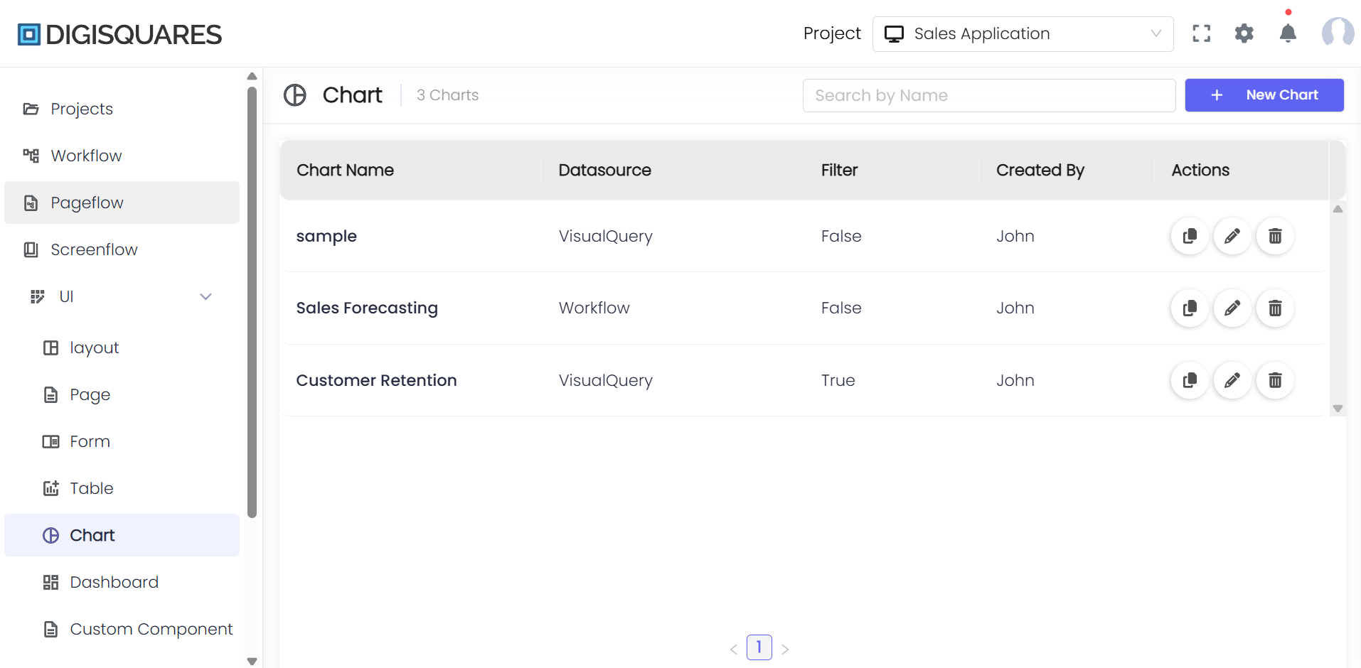
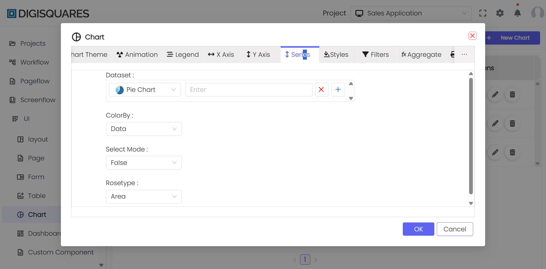
Step-by-Step Guide to Creating a Chart
Step 1: General Settings
- Title: Provide a title for your chart that will appear as the main heading.
- Subtext: Add a subtitle for additional context.
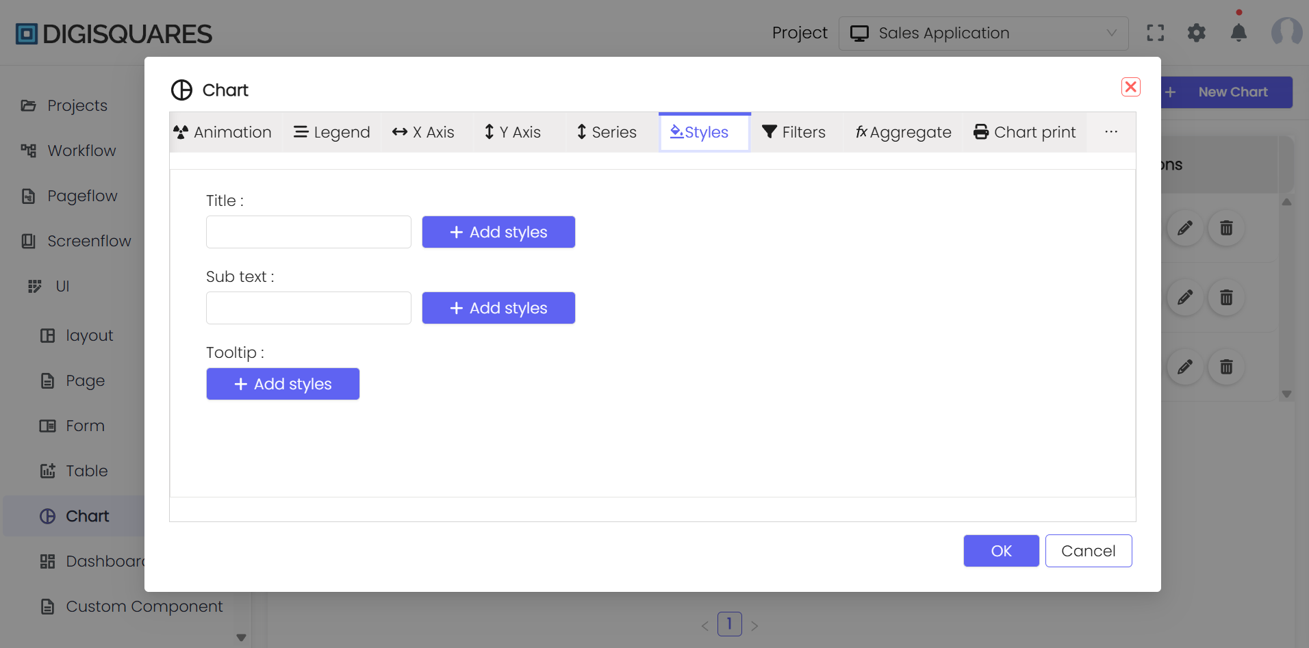
- Tooltips: Enhance data points by adding tooltips. You can style them by clicking 'Add Styles' to adjust the color, typography, and more.
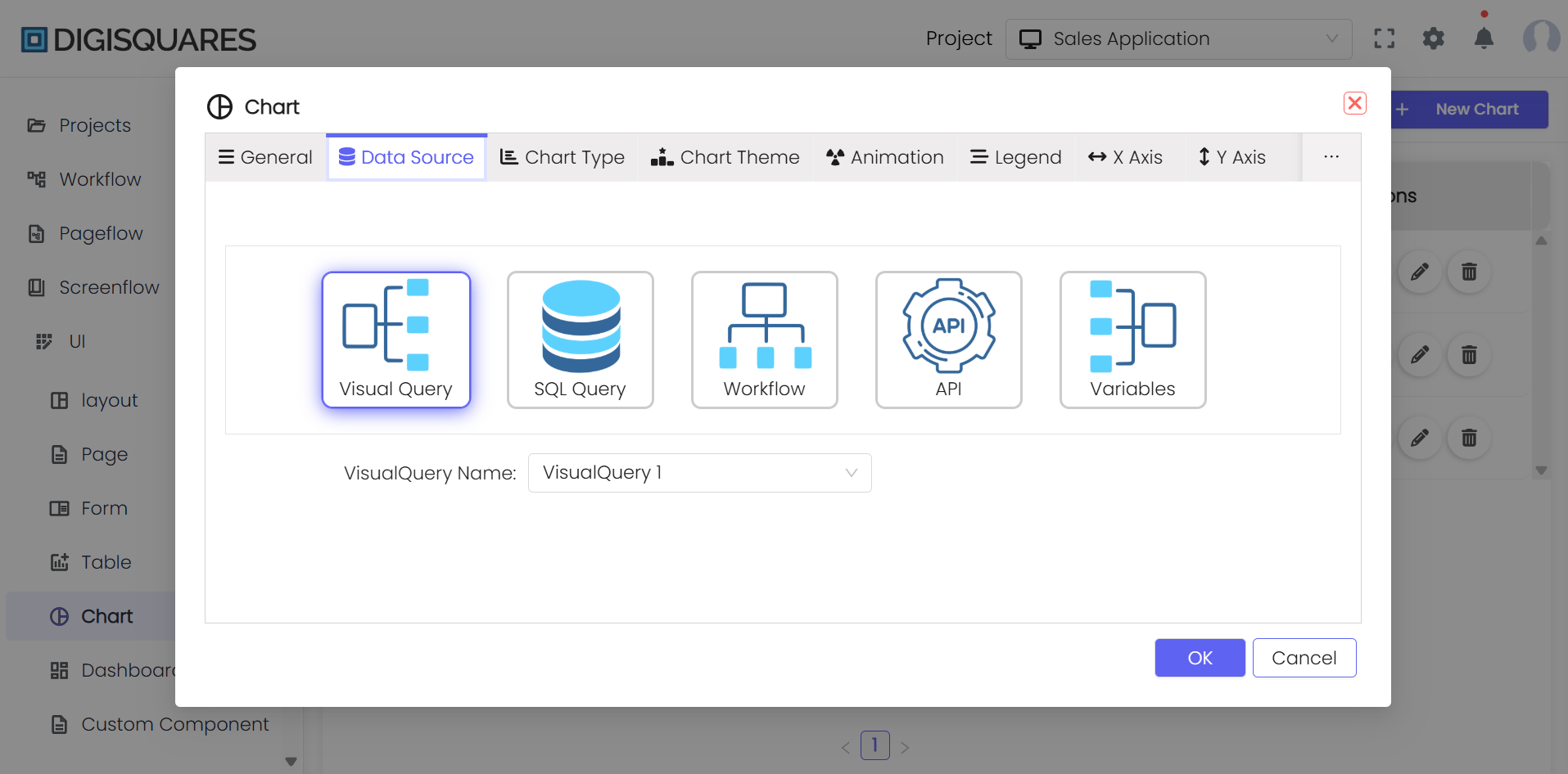
Step 2: Data Source Configuration
- Select your data source (e.g., Visual Query, SQL Query, Workflow, API) to populate your chart with dynamic data.
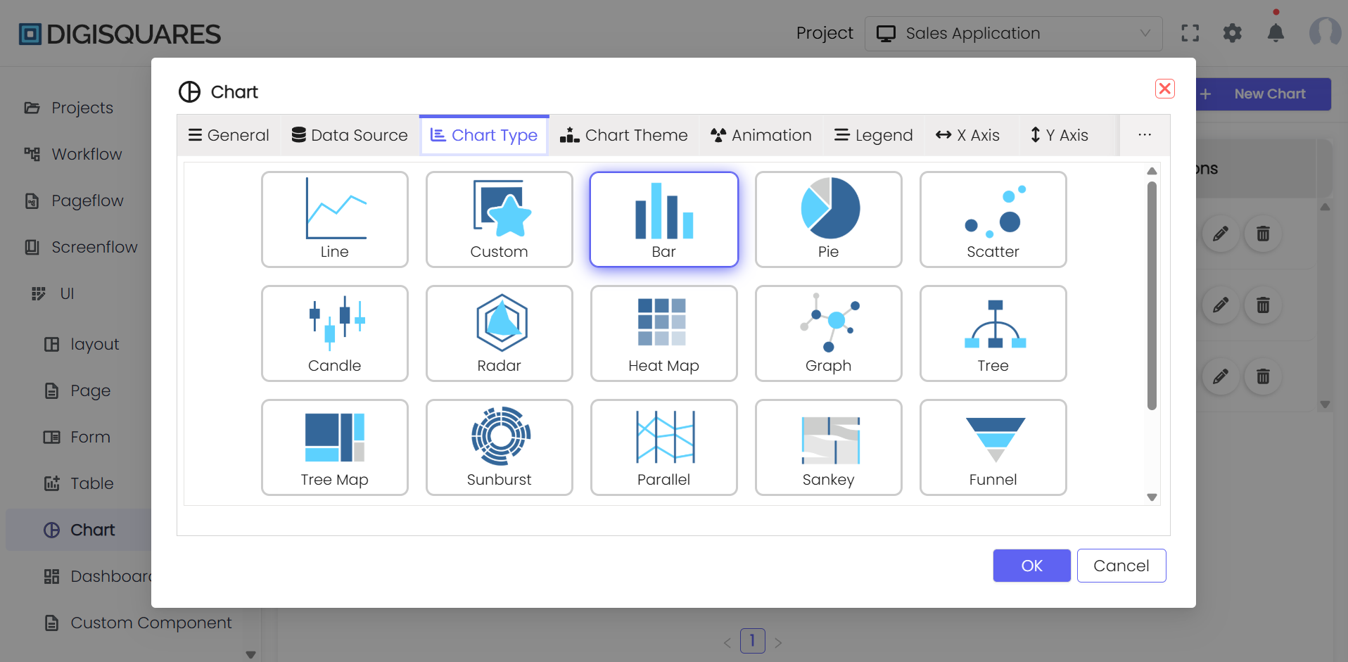
Step 3: Choose Chart Type
- Select a Chart Type: Choose from various chart types such as Line, Bar, Pie, Scatter, etc.
- Customize the selected chart type to match your data visualization needs.
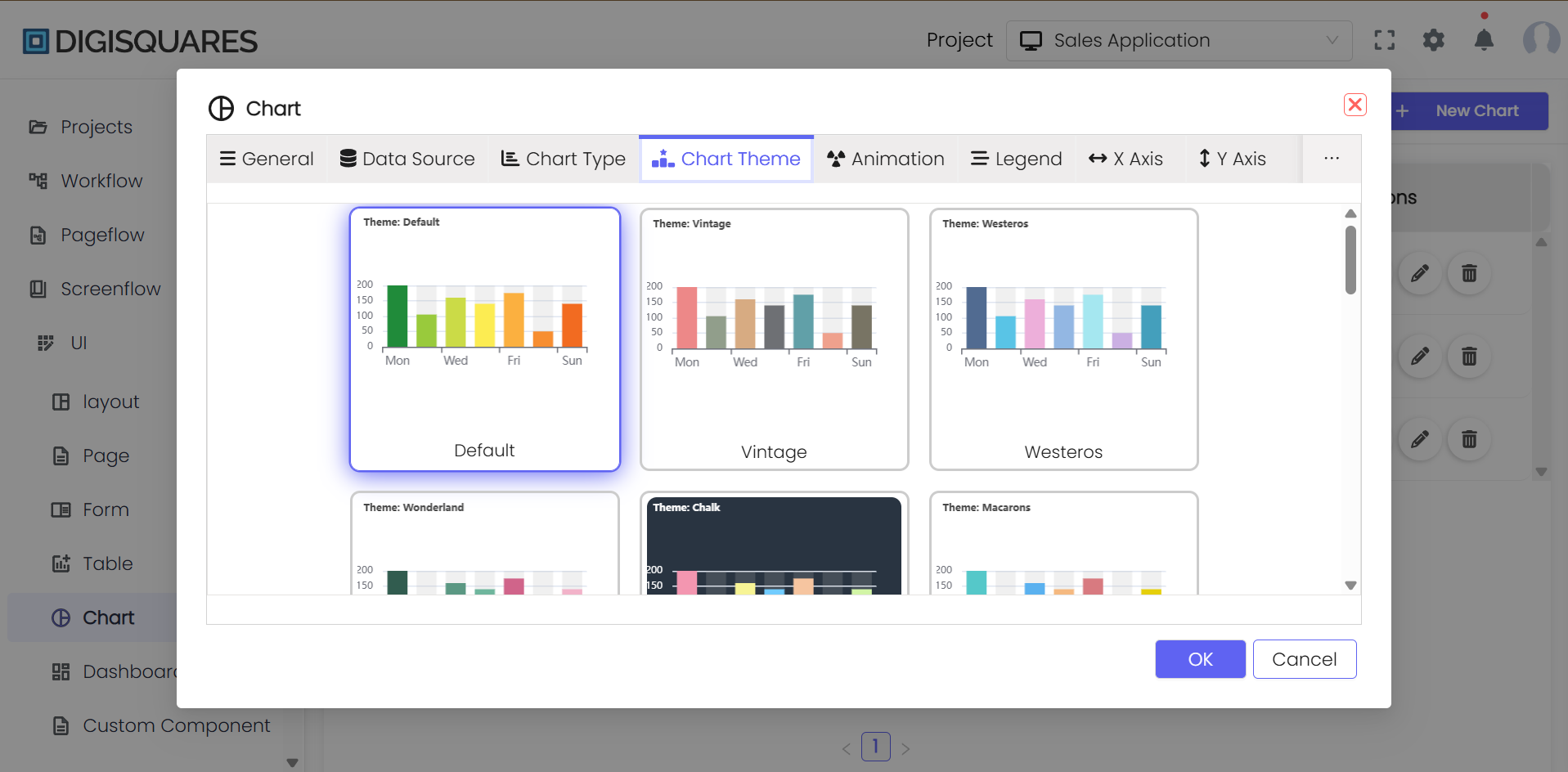
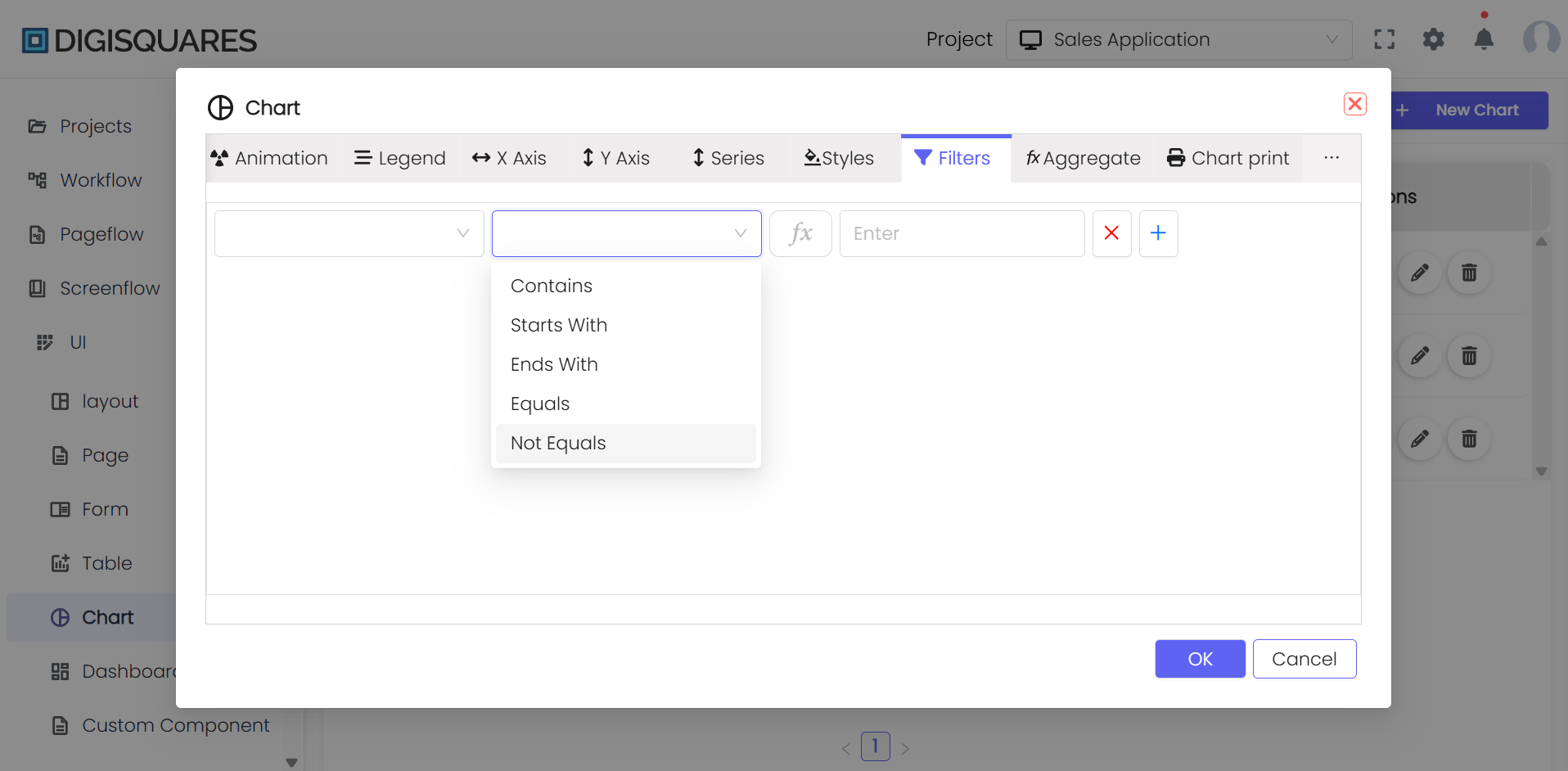
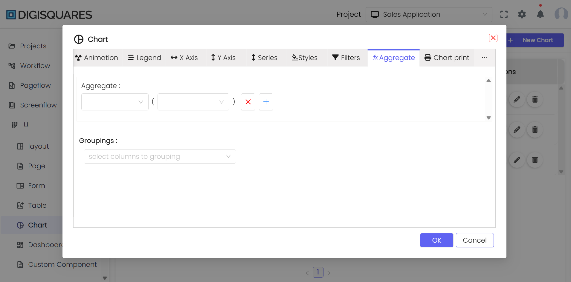
Step 4: Customize Chart Appearance
- Themes: Apply different themes to your chart to change its aesthetic appearance.
- Filters: Implement data filters to display only the relevant data points.
- Aggregation: Use aggregation functions to compute summaries for data groups.
Step 5: Detailed Styling Options
- Styles: Customize the chart’s visual elements such as colors, fonts, axis settings, size, and spacing.
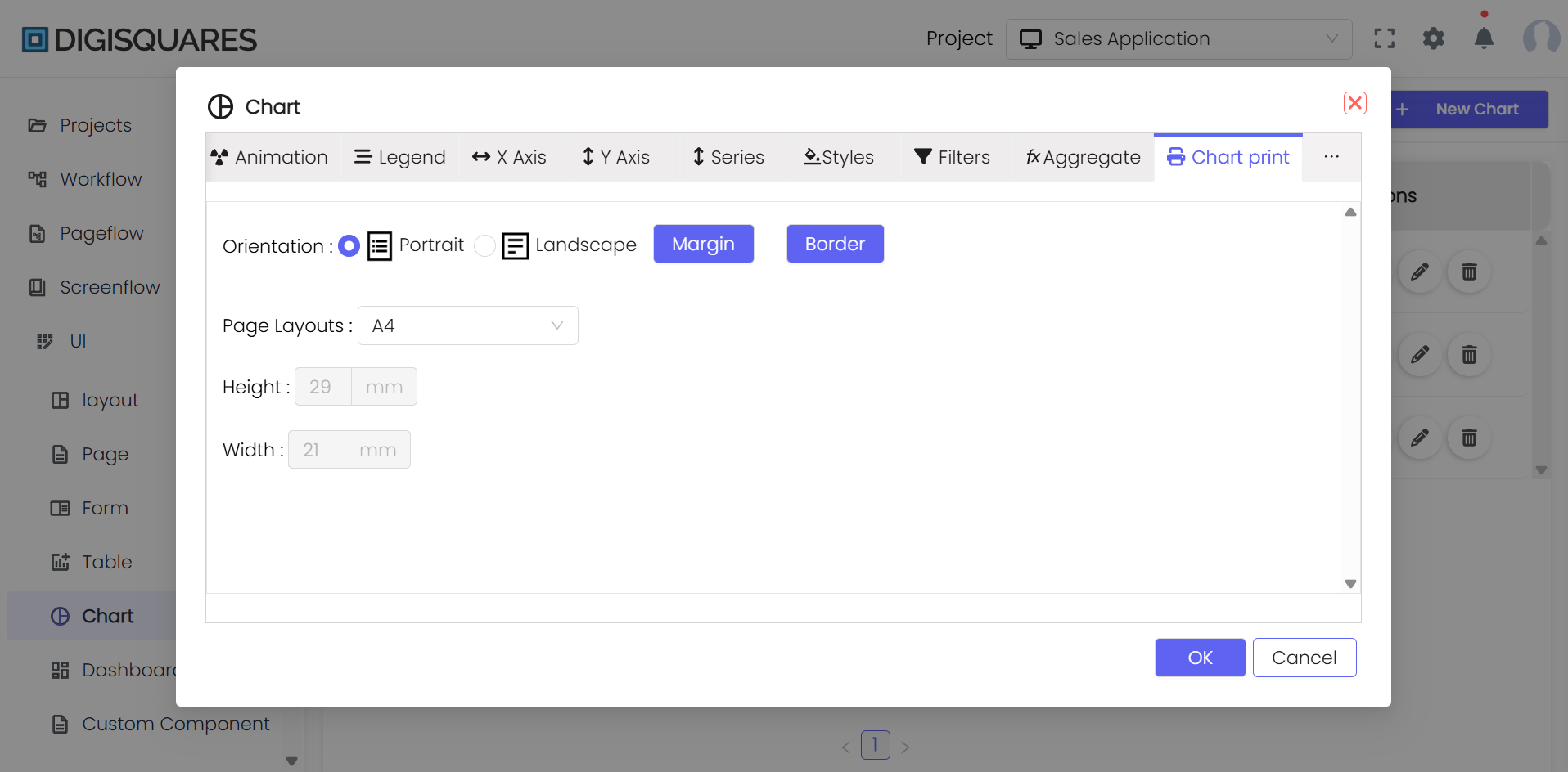
- Orientation and Page Layout: Set the orientation (Portrait or Landscape) and page layout (e.g., A4, Letter) for printing the chart.
- Margins and Borders: Adjust the margins and borders to ensure the chart fits correctly on the page.
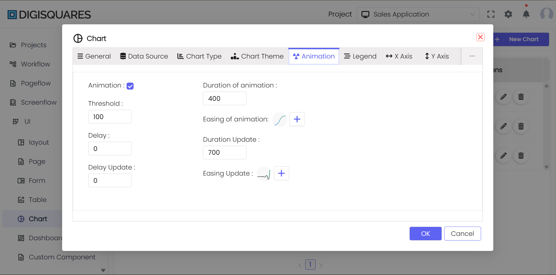
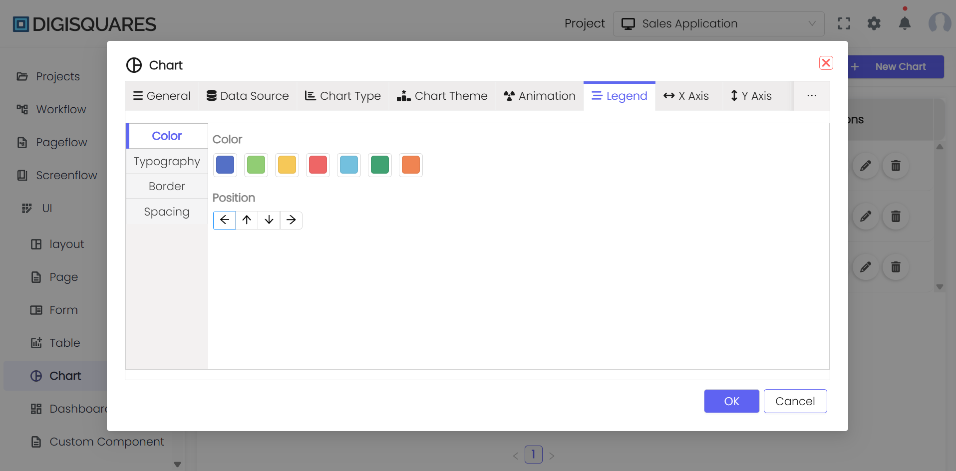
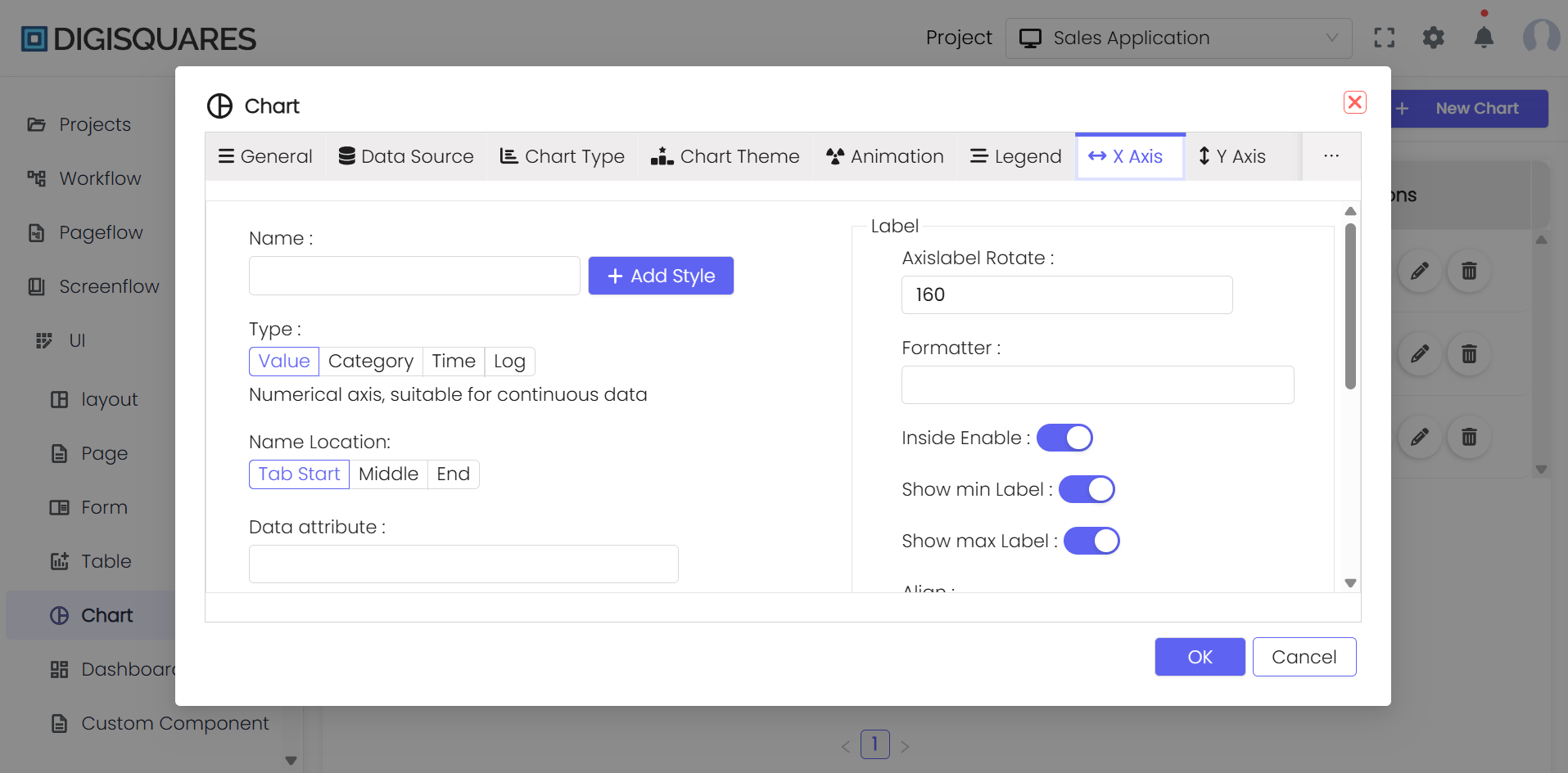
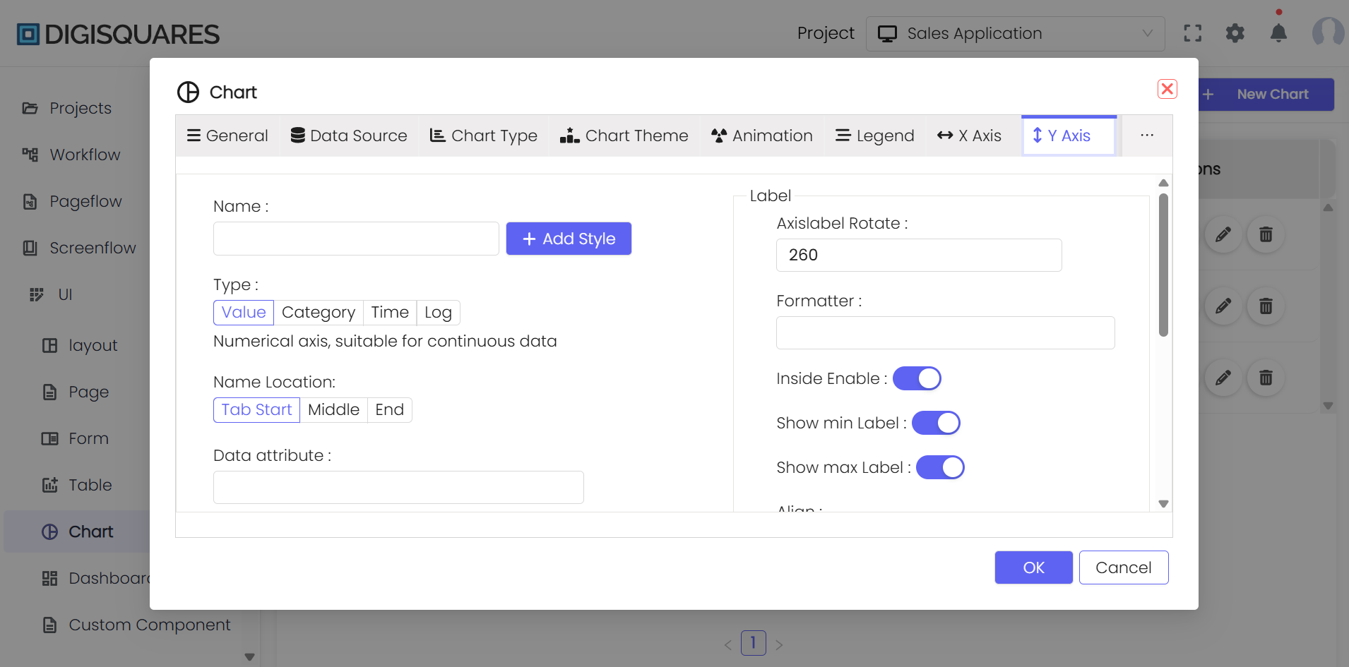
Step 6: Advanced Configuration
- Animation: Toggle animation settings to make the chart interactive. You can adjust settings such as animation duration and easing.
- Legends and Axes: Configure chart legends and modify axis properties to improve data interpretation.
Step 7: Saving and Printing
- After all customizations are done, click 'Save' to store the chart configuration.
- Use the 'Print Chart' option to set up printing parameters and print the chart directly from the platform.
Example Chart Visualizations
Here are some example visualizations created using Digisquares:
Conclusion
The Digisquares chart tool provides robust functionality for creating customizable and detailed data visualizations. By following the steps in this guide, users can configure charts to fit their specific data analysis and reporting needs. This ensures clear and effective presentation of data, making it easier to derive actionable insights.